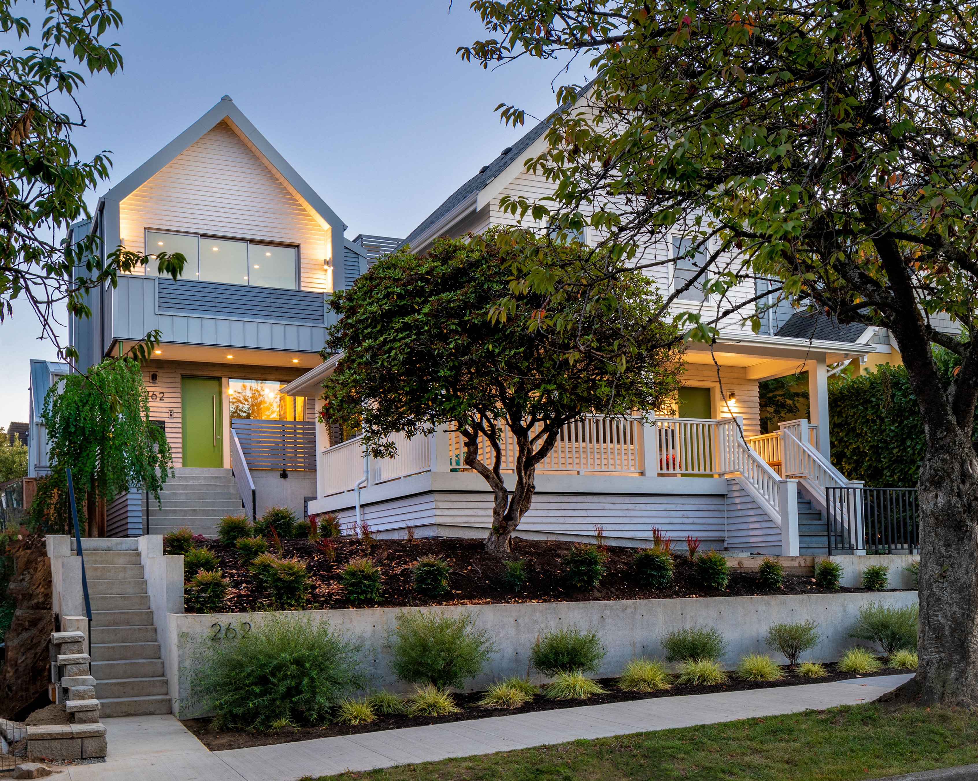
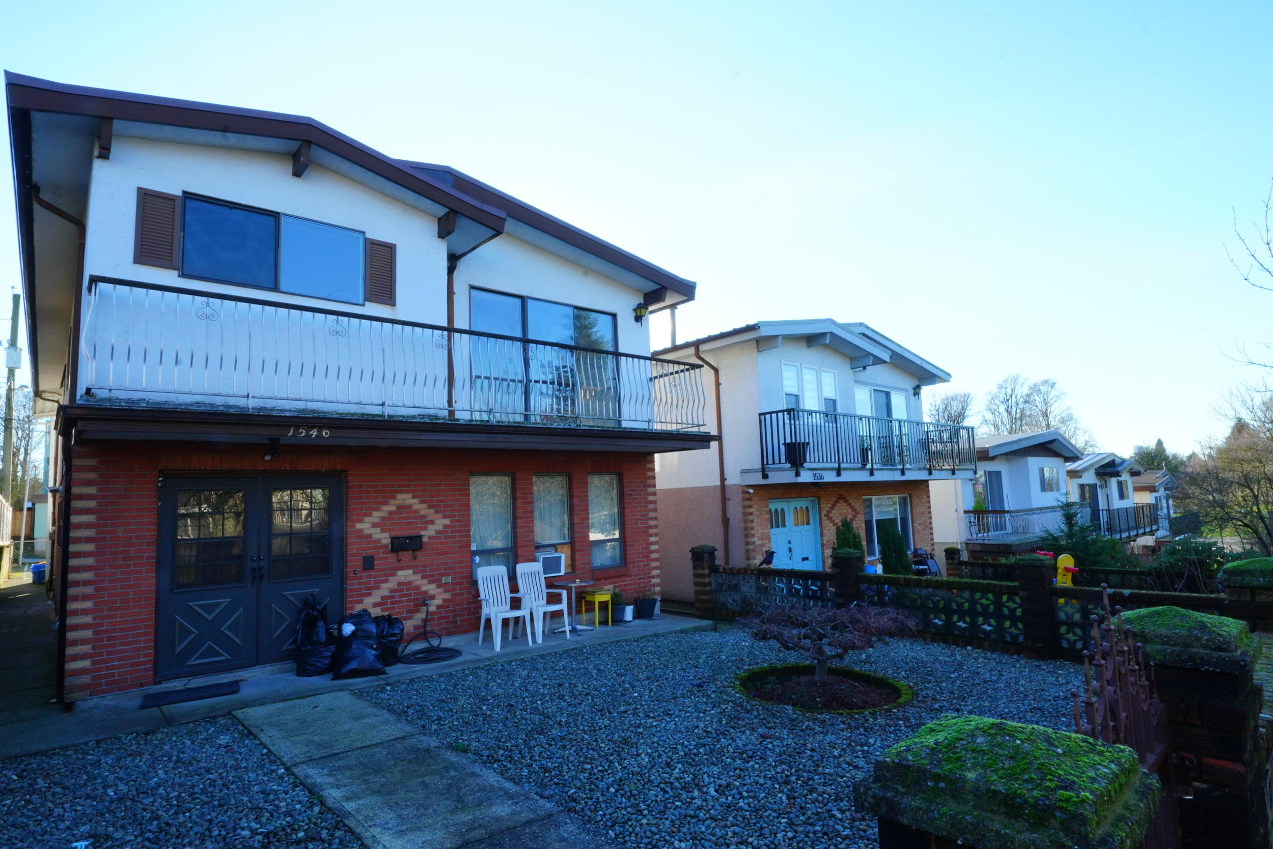
This is a behind the scenes look at our Kerrisdale Residence, in celebration of our 15th year anniversary. Follow our full celebrations with #15yearsNDB on Instagram and Twitter!
This project is a #HAVANawards Finalist in two renovation categories! We were so proud to compete with our local peers in Metro Vancouver. Check out the features of our award on Instagram here.
The central gathering space of this home, and especially the kitchen, made for a gold-brushed feature during awards season. It features so many small details that would only have been possible through our Design Build process.

Every aspect of this home was designed to feel open and welcoming. In the kitchen, this was possible because we engineered the home’s structural beams to be hidden within the custom millwork cabinets. This allowed for the rest of the living space — the dining room, family room and entranceway — to get opened up. What was once a house full of walls and hallways became an open concept modern home.
Also within the custom millwork is a hidden refrigerator, and custom storage solutions for all the family’s cooking and hosting needs. The cabinets are beautiful in their own right, but the hidden refrigerator has become a favourite party reveal.


What makes a difference is the grand welcoming feeling when you step into the home. There is plenty of space for jackets and shoes, but the custom bench and open floor plan offers a calming and restful introduction to the rest of the home.
Overall, our Design Build team innovated solutions to make this home feel bigger, brighter and welcoming. While most solutions aims to update the home, and facilitate a modern lifestyle, we kept many original features. The traditional brick fireplace, with unique glass detailing was kept intact throughout construction. We preserved its facade and designed the seating area to compliment its deep red hues.
We used materials creatively, in order to focus on their best features. Our designers took a creative approach to using tile, which our installers executed perfectly. In the master bathroom, floor to ceiling tilework draws the eyes upwards, and offers an extra shine. Similarly, a classic floral tile design in the laundry room provided visual interest below so that the white details above seemed to float above.

We found connections between the indoors and outdoors by reimagining the garden entranceway. What once was a dark, forgotten basement space became the best place to gather during the summer months. We doubled the width of the backdoor, and created a secondary back patio that offered a soft entrance into the home. With tiered handscaping, we created a covered seating area, and easy route between the backyard and downstairs living space.

The exterior facade received a repaint and refurbishment. The updated early grey paint and finish details feel brighter and more modern. Key to this design was choosing complimentary neutrals, and considering the neighbourhood streetscape.
We are so happy to know this family can enjoy their home and accommodate multiple generations!


.jpg)


